Monday, July 28, 2008

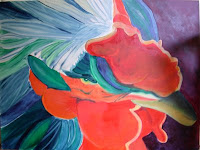
Sidetracked Day 3


I stopped after work today and picked up some larger brushes and some Payne's grey (which was missing from my palette). So I got some real paint down fast today! Funny how using the right tools makes the job sooooo much easier!

I love working big! It really pulls me into the work fast and makes me much looser.
This is drying really fast each day, (I don't have a/c so my apartment gets really warm) so I might be able to ship this after all. Especially, if I keep working this quickly.
I am considering outlining with a gold metallic paint since this really makes me think of my Imari china. Once I am back home and can look at my china, I will be able to more readily decide.

I can always fine tune it once I get back on the mainland.

Sunday, July 27, 2008

Sidetracked Day 2


Finally got a chance to work on this one again. Unfortunately, since I have begun packing, I am left with a small brush! So what I got done today was relatively slow going.

Once I stepped back to take the picture, I was pleased with how bright and colorful it is. Not only is the composition appealing, but the colors too.

I am really happy with how it is going.

Sunday, July 20, 2008

The Judge Day 8--reworked layout


here is the reworked to the grid painting...I will look at this for awhile (not too long because I am running out of time before my move) and decide if this will work out.

Saturday, July 19, 2008

The Judge Day 7--reworked layout


I will not surrender! So today I sat with PS and reworked my compostion using the rules that Michelle Grant offered to me. Once I am satisfied, I will start painting over again.

The picture has lots of artifacts in it from the layers in PS, so just ignore those.

I hope that I am understandiing the motivations that she discussed. I made the foreground large, the background medium, and the middle ground small. I divided the area into the 1/3rds grid and moved important elements around to the intersections.

Friday, July 18, 2008

The Judge Day 7--Verdict


I asked an artist, whom I greatly admire, to help me figure out why this piece kept bothering me.

Michelle Grant ( http://michellegrant.ca Canadian--which I don't hold against her ;)...) showed me how the layout was weak, but then gave me two great planning tools that I can use not just to 'fix' this piece, but carry forward to future pieces.


the pictures here show my piece grided with the 1/3rds composition rule and how the key elements don't line up with any of the intersections. The second image shows my piece cropped so that the key elements hit right on the intersections.


In addition, when planning a piece Michelle states, :The motive involves the division of space beyond the 1/3 rules. You decide which part of the space is going to be largest, and then the smallest, and then one will be the middle size. Here is a grid to hopefully clarify this theory.COLUMN #1 BACKGROUND MIDDLE GROUND FOREGROUND COLUMN #2SMALLMEDIUMLARGEYou take an element from Column #1, starting with your "BACKGROUND" for instance. You then decide which size it will be by choosing one of the sizes from Column #2. The Background could be Small, Medium or Large, but for clarity sake, I'll say the Backgroung will be Small.Then you decide on your Middle Ground, with a choice of Medium or Large, and I will say the I want it to be Medium in size. That now leaves the Foreground to be Large in size in relation to the other areas of the painting. The easiest way to decide this is to write out the Six Elements on a piece of paper into the two columns and draw a line across from Column #1 to Column #2, and none of the Grounds will be the same in size..."


Which makes sense.....so anyway, I am not going to crop this piece down because eliminating the top and the right elements does not appeal to me. But I will re-do this idea and lay it down right before putting any paint on it.


Wednesday, July 16, 2008

The Judge Day 6--stoopid tree!


I think I am just going to take that damn tree out of there!

The Judge---Day 6


I did throw some paint at it last night and I think the reason that the palm shadows bother me is because they don't match the mountain shadow---doh!
So I will change the palm shadows, much easier!
Have to work more form and shadows into the plants under the cat, too.

I got home from work and fiddled with the image in PS to see if my thoughts were on the right track.

I darkened the mountain form shadow, added some of the barn red up into the palm tree tops, lightened the palm cast shadows (they still need to have the angle corrected I think), put some shadows and lights into foliage, and worked on some overall color spots on the cat.